The academic and scientific community produces large amounts of data through their research, and data visualization is a key skill for researchers across all disciplines. Presenting qualitative data visually from one’s research can transform the final output, and one does not have to spend enormous amount of time to accomplish this. Researchers who need to communicate quantitative data have several options to present it visually through bar graphs, pie charts, histograms and even infographics. However, communicating research findings based on complex datasets is not always easy. This is where effective data visualization can greatly help readers. Data visualization is the representation of information and data in a pictorial or graphical format highlighting the trends and outliers and making it easier to understand. Effective use of data visualization techniques helps to focus readers’ attention on critical information, in a way is both simple and engaging.

Many researchers are often under the false impression that presenting qualitative data visually is a complex exercise, but it is not. Today, there are numerous qualitative data visualization tools and techniques that can be used by both beginners and experts alike. Using data visualization to communicate important data can enhance the impact of the researcher’s work thereby making it more meaningful and engaging to potential readers. Adding visuals like graphs and charts can make it easier for not just for researchers to communicate experimental results and share details of interesting new discoveries but also allows readers to analyze and understand complicated data sets and concepts. A study in The Economist revealed the number of citations jumped 120% when a research paper included infographics.1
Let us look at some ways to make the best use of data visualization techniques that will help present your qualitative research data and information effectively.
Pair the right kind of visuals to convey specific data sets
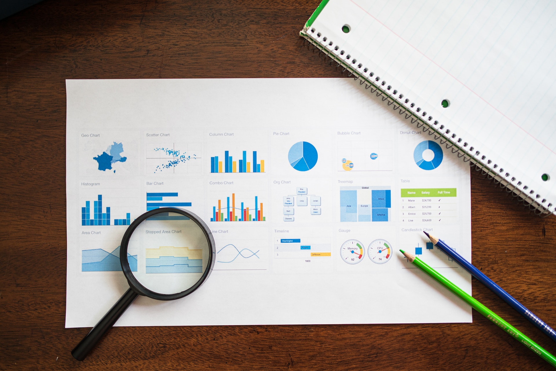
The human brain is wired to quickly analyze and understand visual cues which is why it is important to add visual elements in your research paper. Plotting data using charts, graphs and infographics allows readers to quickly identify underlying patterns of data that would otherwise be difficult to comprehend when reading through paragraphs of text. However, using the wrong kind of visuals can be misleading, and reduce readability and comprehension.
Today, with more and more scientific knowledge being conveyed visually via social media, researchers are experimenting with communicating research through different types of visuals. However, using the right kind of visuals is imperative to ease the public understanding of science.
In fact, an interesting study in the Journal of the American Statistical Association by William Cleveland and Robert McGill sheds light on how human perception affects how we decipher graphic displays of data; this made some kinds of charts easier to understand than others. The statisticians were able to prove that charts based on the lengths of bars or lines, such as in a standard bar chart were the easiest to read – especially, when trying to discern small differences between values. Pie charts on the other hand were acceptable only in limited contexts so were rarely the right choice.2
Focus on balancing form and function
There are several data visualization software and programs available to researchers today that simplify the process of presenting data visually. What needs to be kept in mind, however, is that quantitative data visualization is not just about beautifying graphs to make them look better. Neither is it about heaping information into an infographic to communicate different aspects of research. Researchers must understand that to be effective, data visualization must be a delicate balance between form and function. While a plain graph could be too boring to attract and hold reader attention a beautiful visual could also fail in its endeavor to communicate the right message if it is not presented properly. The data and the visuals need to work together to create a compelling narrative that combines research analysis with storytelling.
Be aware of the use of colors and shapes
While incorporating quantitative data visualization techniques it is recommended not to rely only on the default templates available within software and programs but instead customize and define the layout according to your specific needs. Choosing the right colors and shapes to indicate various categories is very important. For example, it would be appropriate to use light colored text on a darker background to enhance readability. Researchers can also choose to use different shapes to indicate separate data sets and categories of information and use varying sizes to stress the frequency of data. One can also use similar vectors to add a touch of ingenuity to the visuals being used. It is best to avoid using vivid effects and abstract images for denoting differences in data as they can distract readers from key information points being conveyed. Most importantly, avoid adding too many visuals or graphics. Researchers must use visuals only where necessary and align them with the information provided.
While many early career researchers and academics might find it challenging to visualize qualitative data and present it in a manner that is easily understood by an audience, this is an art that should be cultivated and can be mastered. This is where Mind The Graph comes in help researchers get more creative with science communication by offering them a simple way to present data visually. A powerful AI tool for scientists, Mind The Graph is home to the world’s largest scientifically accurate illustrations gallery with over 40,000 illustrations across more than 80 research fields. Choose a format to communicate your research and use one of the 200+ pre-made templates to create powerful scientific infographics, posters, graphical abstracts, and presentations for your own research. It’s a quick, effective, and powerful way to communicate your science to the world. And the best part is that you can now get Mind The Graph at a steal by subscribing to Researcher.Life, which unlocks access to this data visualization tool as well as other premium AI tools and services designed to help you succeed.
References:
- Graphic Details, The Economist, June 2016. Available at https://www.economist.com/science-and-technology/2016/06/16/graphic-details
- Mason, B. Why scientists need to be better at data visualization. Knowable Magazine, 2019. Available at https://knowablemagazine.org/article/mind/2019/science-data-visualization