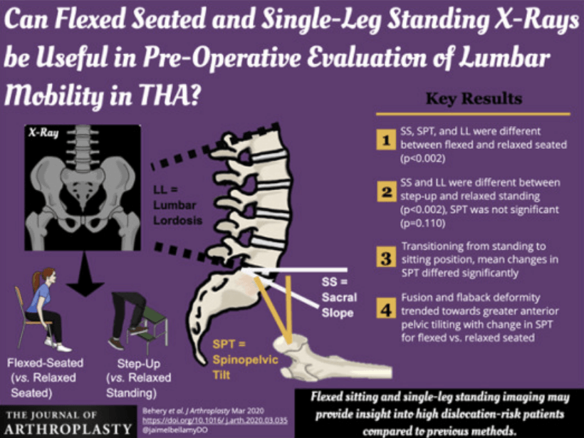
Science communication has long been an issue due to the many obstacles between the complex scientific knowledge and the readers. Sometimes, a subject is so complex that it requires specific previous information even to understand the title. You may have heard of infographics, this appealing way of “telling a visual story” while effectively communicating good consistent scientific data. If you have not heard of this tool of visual science communication before, the time has come.
The power of visual science communication
Visual communication has long been perceived as the best way to communicate complex topics, where images may speak more than words. This is also true in topics published in scientific papers, where a wall of words – full of jargon – is placed between the reader and the content, which is normally complex in itself. And therefore, in the world of life science, visual communication becomes of utmost importance.
Visual design can help bridge this science communication gap with the use of infographics. In this niche, you’ll probably recognize them as “science figures”, “diagrams” or “graphical abstracts”, and we’ll let you know why you – as a scientist – should try to learn this language as soon as possible to attract more readers to your papers.
There are already a few studies of meta-science defining how the use of visual design is boosting science communication:
- Considerations for effective science communication
- A picture is worth a thousand words in medical writing
- Scientific communication: the art of preparing and presenting scientific results
- A Picture Is Worth a Thousand Views: A Triple Crossover Trial of Visual Abstracts to Examine Their Impact on Research Dissemination
- A Crossover Randomized Trial of Visual Abstracts Versus Plain-Text Tweets for Disseminating Orthopedics Research
- Preparing Infographics for Post-publication Promotion of Research on Social Media
In the first article on visual science communication, infographics are highlighted as one of the main elements of practical science communication strategies that you should consider to stand out while communicating science to a mass audience.
According to another study by “The Economist”, the number of citations increased 120% when a research paper included an infographic.

An infographic maker for scientists
Visual science communication is not a discipline taught in most of the science-related courses, and more often than not, researchers lack appropriate design skills or access to professional software. That’s the gap Mind the Graph aims to fill: turning scientists into designers and unlocking creativity with all the resources needed for effective visual science communication.
To create professional-looking science images for a publication, you need:
- Images with consistent artwork style
- Scientifically accurate illustrations
- Layouts with intuitive reading flow
- Charts, symbols and icons
- Appropriate font styles
You can find it all in Mind the Graph, as it was created with the scientists’ needs in mind.
Now that you know the importance of visual science communication, here is a short list of reasons why you should start using Mind the Graph right now:
- Find all the illustrations you need to create awesome science figures
- Never waste time again looking for visual content in Google
- Rely on professional designers to guide you with special templates
- Ease visual science communication with all the features you need in an intuitive drag-and-drop interface
- Many formats are available, including graphical abstracts, slides and posters.
- Download everything in high resolution directly to the publisher!
- There’s a free version available, and you can save lots of money in the subscription since it’s included in the Researcher.Life platform.
Mind the Graph also provides an artificial intelligence (AI)-powered tool that can help you solve another frequent problem in visual science communication: posters for conferences.
If you haven’t seen the Poster Maker yet, you should try it right now and start saving time (and money). It’s simply the best tool for creating a whole poster out of any published paper or conference abstract in a few clicks.
Researcher.Life is a subscription-based platform that unifies top AI tools and services designed to speed up, simplify, and streamline a researcher’s journey, from reading to writing, submission, promotion and more. Based on over 20 years of experience in academia, Researcher.Life empowers researchers to put their best research forward and move closer to success.
Try for free or sign up for the Researcher.Life All Access Pack, a one-of-a-kind subscription that unlocks full access to an AI academic writing assistant, literature reading app, journal finder, scientific illustration tool, and exclusive discounts on professional services from Editage. Find the best AI tools a researcher needs, all in one place – Get All Access now at just $25 a month or $199 for a year!


