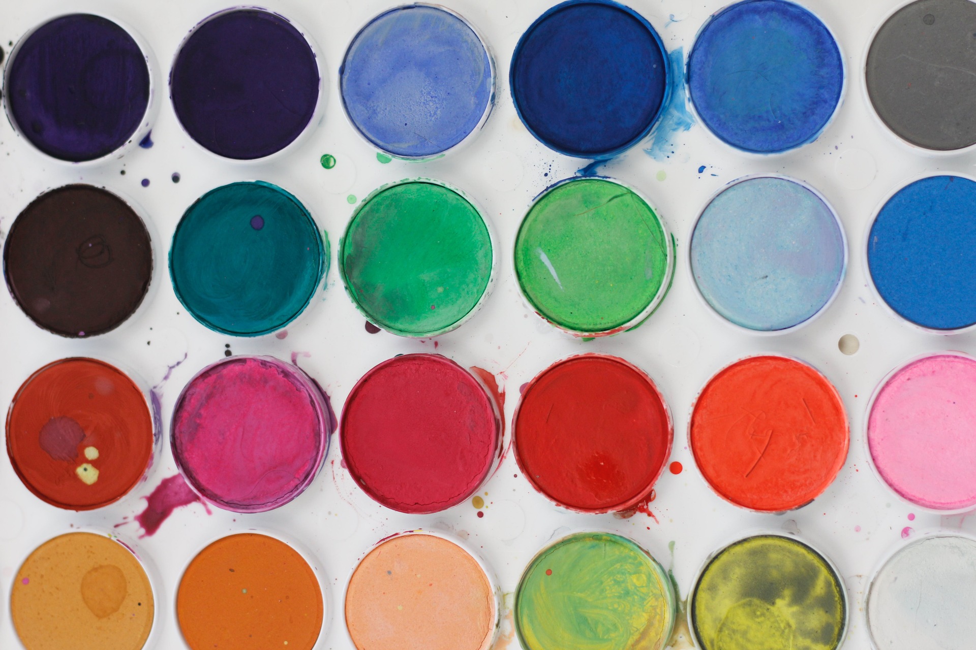
One way of ensuring that research is communicated in an engaging, impactful way is to use appropriately designed visual tools where possible. Why? Because our brains process visuals 60,000 times faster than they do text.¹ Information conveyed as visuals or infographics using different colors makes it possible to present complex concepts and quickly. However, selecting an effective scientific color palette can be a daunting task, given that most people have an innate tendency to follow personal tastes – which may not always be the best choice.
Using a carefully chosen scientific color palette can enhance scientific papers and help draw the reader’s attention to essential information. Additionally, the proper use of colors can ensure that readers are able to navigate more effectively through the information that you want to impart.
Understanding colors and their meaning
A practical method to improve the design for data visualizations is to apply color psychology to communicate accurately. Experts recommend using specific hues for different elements on the paper, which will allow readers to connect the color with the element instinctively. Alternatively, you can also explore using the saturation and depth of the hue to present information more harmoniously and effectively. For example, given that most people associate the color green with nature and flora, it may be a better choice of color to use instead of yellow to orange when presenting data on vegetation. Moreover, different shades of green could be used to convey information – light green for areas with lower green covers and darkest greens for forests and green belts.
Using colours for those with vision impairments
When choosing a scientific color palette for your images or graphs, be mindful of those with Color Vision Deficiencies (CVD) or color blindness, who may have difficulty distinguishing between different colors with low contrast. According to available statistics, roughly 1 in 12 men and 1 in 200 women have other forms of CVD – making them unable to differentiate between red and green.² Therefore, experts recommend avoiding the excessive usage of primary red and green colors and suggest using clear labels, fill patterns, or shape outlines to help differentiate between varied information.
How to choose the right colors
There are different color schemes and strategies that you can use for scientific research papers. An effective strategy is using color coding. It is a simple process of identifying other elements using the scientific color palette. For example, shades of blue and red are often used to denote temperatures on a heat map. The use of red makes the audience think hot (increase), and the use of blue indicates cold (decrease). Similarly, the use of green and brown on a map can convey information about how rainfall impacts the fertility of land. You can also choose to have only one color stand out from the others on a graph to highlight the main point of your research results.
Struggling with choosing the right colors for scientific infographics? Mind the Graph offers a user-friendly interface, making it easy for researchers to design their scientific infographics without requiring advanced design skills. Try it today with Researcher Life’s All Access Pack.
Be consistent with your choice of colors
Choosing appropriate colors from the scientific color palette and ensuring consistency in elements such as fonts, shapes, icons, and images is critical to ensuring that visuals are effectively presented. While it is essential to consistently use the same colors to represent the same data sets, it is also crucial to assign specific colors to variable data points so that viewers can quickly identify patterns in the data when required. For example, when representing multiple datasets, using distinct colors for each set can help viewers differentiate between them. Avoid using too many colors in a single graph, as this can make the content unreadable. Also, ensure that the color choices support the main message and align with the data being presented.

Tips to choose an appropriate scientific color palette
Here are three simple tips to help you choose the right science color palette for your scientific papers.
- Experts suggest limiting the usage of colors to no more than five in a particular image or infographic. Try to use them as consistently as possible. You can use these colors to emphasize points, draw attention, or even evoke meaning.
- Try using a scientific color palette wherever appropriate to convey essential information. For example, a bar chart indicating papers published per year does not need to be in color. Yet marking a year with the lowest papers as red or any other color will make the information stand out, making it easier to assimilate.
- Using sequential shades of color saturation to display similar data points of varying intensities may be a good idea. You can also use a divergent science color palette to display data in different directions, with two contrasting sequential color palettes.
For those looking for a convenient way to implement these tips, tools like Mind the Graph offer a wide selection of design options. With a vast library of over 75,000 meticulously crafted science illustrations and a user-friendly interface, Mind the Graph gives researchers an array of intuitive design options. Whether it’s conveying complex ideas or showcasing intricate data, this scientific infographic maker can help you transform your research into eye-catching visuals that captivate the audience and leave a lasting impression.
Experts suggest experimenting with different color palettes and evaluating the overall effectiveness of your visuals. Seeking feedback from peers or collaborators on the choice of your science color palette may be a good idea, too. Remember to stick to using minimalist designs and muted colors to increase the aesthetic value of your visuals.
References:
- S. Fotis Jr. The Power of Data Visualization. Aegis IT Research. May 2020. Available online at https://aegisresearch.eu/the-power-of-data-visualization/
- Best Color Palettes for Scientific Figures and Data Visualizations. Simplified Science Publishing. Available online at https://www.simplifiedsciencepublishing.com/resources/best-color-palettes-for-scientific-figures-and-data-visualizations#:~:text=For%20example%2C%20the%20use%20of,point%20of%20your%20research%20results
Researcher.Life is a subscription-based platform that unifies top AI tools and services designed to speed up, simplify, and streamline a researcher’s journey, from reading to writing, submission, promotion and more. Based on over 20 years of experience in academia, Researcher.Life empowers researchers to put their best research forward and move closer to success.
Try for free or sign up for the Researcher.Life All Access Pack, a one-of-a-kind subscription that unlocks full access to an AI academic writing assistant, literature reading app, journal finder, scientific illustration tool, and exclusive discounts on professional services from Editage. Find the best AI tools a researcher needs, all in one place – Get All Access now for prices starting at just $17 a month!

