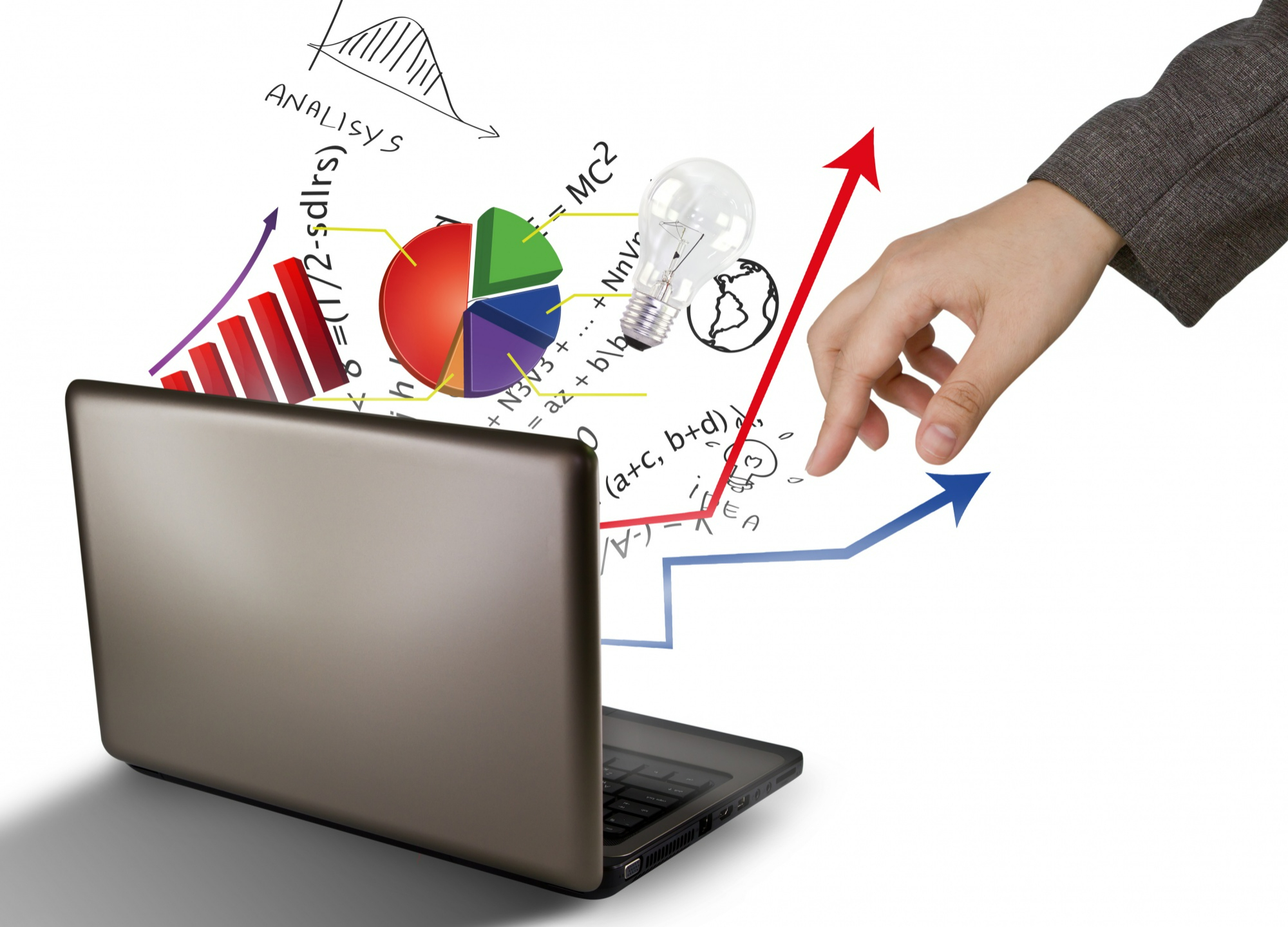
Human beings are visual creatures, and this is where research infographics come into play. According to an interesting study, 90% of the information transmitted to the brain is visual.1 In fact, humans are capable of processing visuals 60,000 times faster than text.2 This is why the use of research infographics is an important and popular way to communicate complex scientific information in a simple, easy-to-understand way. Using appropriate visuals when writing your manuscript is a great way to enhance your research effectiveness and reach, ensuring it is read and understood by a wider audience. In this article, we will explore the importance of using research infographics, how it can help improve your article, and how to present data in research infographics effectively.
What is a research infographic?
Infographics are visual representations of data, information, or knowledge that can help researchers and authors to communicate complex concepts in a way that is simple, engaging, and effective. By using research infographics, researchers can ensure that readers are able to understand and retain key messages faster and more efficiently. The clear, concise representation of data can reinforce your arguments, provide context, highlight the significance of your findings, and adding credibility to your work. This was confirmed by a study undertaken by Cornell University, which found that if a scientific claim is presented in simple text or numerical values, 68% of people will believe that the information is accurate and truthful. But if you add a simple visual or infographic to the claim, the number rises to 97%!3
Advantages of using research infographics
Research infographics leverage the power of visual representation to convey complex data and ideas in a concise and engaging manner. Here’s why they are an excellent addition to your research article:
Helps simplify complex scientific processes and concepts
Many academic writers find it difficult to convey complex scientific concepts and processes, which is where visuals work best. Breaking down concepts into easily digestible research infographics allows readers to quickly grasp the key takeaways of your research, driving greater impact than using just hard statistics. A good example here would be the simple visualization of complex scientific processes to show how certain results were achieved.
Enhances comprehension and retention of data
By combining text and visuals, research infographics cater to different learning styles, enhancing the overall understanding and retention of your research findings. For example, a line graph of increasing levels of stress in academia can help visualize the growth of the phenomenon more easily.
Grabs the readers’ attention and interest quickly
In text-heavy research papers, research infographics stand out and capture readers’ attention by conveying relevant information quickly, compelling them to delve deeper into your article. One impactful research infographic example is emphasizing the effect of drastic climate change through well-designed visuals that convey the speed at which our icebergs are melting.
Broadens the audience reach of your research
Visual tools like research infographics employ colors, fonts, shapes, and symbols to highlight and convey the most relevant findings of your research, while also clearly defining its implications. This helps to transcend language barriers, making your research more accessible to a global audience, including those with diverse language backgrounds. For example, using graphs and charts to visualize trends, correlations, and patterns in your data work better than text to convey the significance of your findings.
How to create effective research infographics
Creating impactful research infographics doesn’t have to be daunting. Follow these simple steps to craft compelling visuals for your research article:
- Define the purpose and audience: Before you start creating your research infographic, identify who it is meant for and what it is meant to convey. This will determine the type of infographic, the information to be included, and dictate the final design.
- Gather and organize the data: Next, organize and arrange the information in a logical and coherent manner. Ensure a clear flow that guides readers through your research findings without confusion.
- Choose a suitable format: Select visual elements and formats (timelines, maps, charts, images, graphs, etc.) that best represent your data and complement your research narrative effectively.
- Design the infographic: Avoid information overload and stick to a clean minimalistic design layout that highlights the core message. Be careful not to overwhelm of distract the audience with fancy fonts, random icons, and irrelevant images. Use colors to enhance the visual appeal and emphasize key points.
- Cite sources correctly: Accurately cite the sources used at the end of the research infographic or within the infographic itself. By giving credit to original authors you can help avoid any plagiarism.
Mistakes to avoid when creating research infographics
While research infographic can be a valuable addition to your research article, beware of these common mistakes.
- Misleading representation: Ensure your visual representations accurately reflect the data and take care to avoid any manipulation that may mislead readers.
- Inadequate labeling: Provide clear and concise labels for each element in your research infographic, ensuring easy comprehension.
- Overcrowding data: Avoid cramming too much information into a single research infographic or it could leave the reader confused. Instead, create multiple infographics to maintain clarity.
- Ignoring accessibility: Make your research infographics accessible to readers across the globe by providing alternative text descriptions for images and graphics.
Clearly, the use of visuals and infographics in academic writing can be powerful tools for conveying complex concepts and data as it allows us to process different types of patterns more easily than text and therefore, they must be an important addition to papers and manuscripts submitted by researchers.
References:
- Alexis, C. 29 Incredible Stats that Prove the Power of Visual Marketing. Movable Ink, October 2022. Available at https://movableink.com/blog/29-incredible-stats-that-prove-the-power-of-visual-marketing
- Words Of Wisdom: Using Data Visualization For Data Storytelling, CSpring Blog. Available at https://cspring.com/data-visualization-for-data-storytelling/
- S. Fotis Jr. The Power of Data Visualization. Aegis IT Research website, May 2020. Available at https://aegisresearch.eu/the-power-of-data-visualization/
Researcher.Life is a subscription-based platform that unifies top AI tools and services designed to speed up, simplify, and streamline a researcher’s journey, from reading to writing, submission, promotion and more. Based on over 20 years of experience in academia, Researcher.Life empowers researchers to put their best research forward and move closer to success.
Try for free or sign up for the Researcher.Life All Access Pack, a one-of-a-kind subscription that unlocks full access to an AI academic writing assistant, literature reading app, journal finder, scientific illustration tool, and exclusive discounts on professional services from Editage. Find the best AI tools a researcher needs, all in one place – Get All Access now at just $25 a month or $199 for a year!
