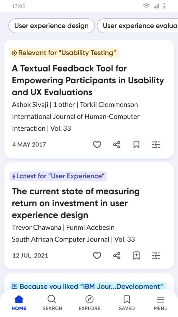
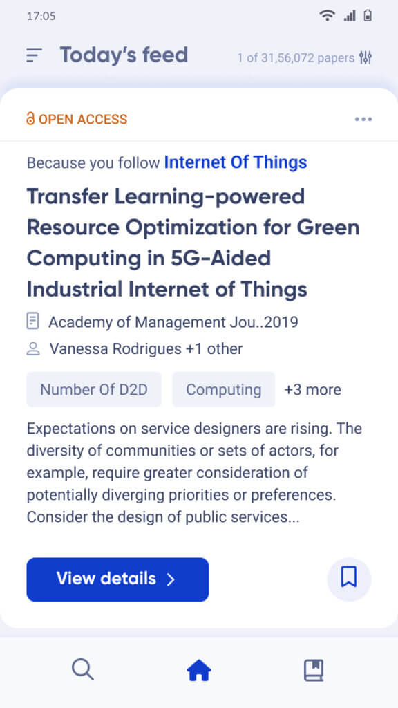
 When we launched the R Discovery app in 2020, we had one goal — to help researchers save time. The R Discovery app was designed to help researchers find relevant research faster, read smarter, and rapidly gain a sense of the research landscape. We were focused on scaling our product, experimenting and iterating to understand what our users really want, while establishing a digital presence around the world.
As we hit our stride, quickly crossing a million downloads, we were increasingly aware of the need to recenter the user experience around our evolving vision and goals. The challenge was to design one simple and consistent experience that could work to deliver a wide range of content for different types of researchers. Informed by user research, we embarked on a redesign to optimize the design and information architecture of the app, ensuring a better reading experience for you.
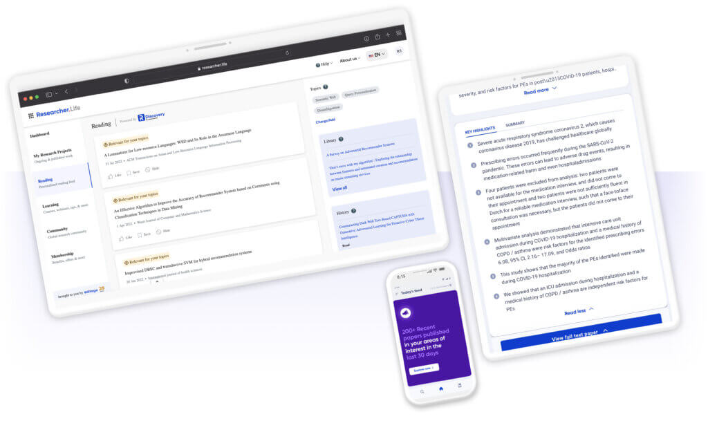
Highlights of the R Discovery 2.0 redesign
Driving personalization
Proud as we are of our best-in-class AI-driven recommendation system, we want to ensure that our researchers have full control over their reading experience on R Discovery. So we made changes like giving prominence to specific meta data and created actions to encourage users to shape their feed according to their needs. Practicing transparency in how the recommendations work, we now enable users to choose from a holistic research field to a more granular level, for e.g., users can even assign importance to each of the topics they follow.
Simplified navigation and interaction
The new app design balances simplicity with utility, presenting all the required information in an easy-to-understand manner. The updated primary navigation allows users to quickly orient themselves on the app, and easily find and retrieve links to further information. Task flows throughout the app have also been updated to reduce time taken for tasks.
A streamlined design system
Building upon the existing Researcher.Life design system, we updated all components with a new visual layer, giving it a fresh look. This streamlined design system and pattern library will support upcoming design experiments, setting us up for scale and complexity, while maintaining consistency.
The story behind R Discovery 2.0
Our approach
While it was clear that we would need to do many things better, we started with asking ourselves how we can help researchers:
- Get started with R Discovery
- Discover relevant research faster
- Access and use the papers they discover
1. How can we help users get started with R Discovery?
Finding relevant scientific papers in the ocean of information can be overwhelming. And so can exploring a new tool. To simplify this process for our users, we prioritized design principles like minimalism, chunking information, and progressive disclosure. User testing our product not only helped us identify potential road blocks, but also allowed us to refine task flows and communication.
We encountered two types of users — those who know exactly what they’re looking for (keywords, journals, etc.), and the ones who just want to get started and are more comfortable with sharing their existing reading lists (as papers or by syncing with their existing personal library) Now, both groups of users can easily update us on their preferences, thereby enabling our AI engine to start recommending scientific papers.
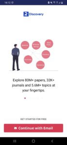
2. How can we help researchers discover relevant research faster?
This was the biggest change in the interface. Across all our conversations with researchers, a common thread was that they liked focus, and the new reading experience has been built to ensure this. We went from a continuous scroll of smaller article cards to a larger, focused display that enables you to evaluate one paper at a time. This visual pause helps in concentrated and quicker decision-making, while the swipe interaction gives you more control on working through a long list. Keeping in mind user feedback, we added key elements like tags explaining why the paper matters, topics covered, and some part of the abstract allowing researchers to quickly evaluate relevance and deciding whether they should read a paper further. We also pruned the actions available on the feed to minimize other distractions.
We also simplified the navigation, making it more consistent with our users’ mental models. The menu was restructured, improving visibility of the options and affordance of actions. We also made the feed settings more accessible, and simplified the topic ranking interface to seek explicit input from users on their preferences.
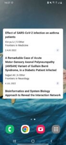
Our Home Screen widget is one of the little ways in which we aim to make research discovery and reading an effortless part of a researcher’s day.
3. How can we help researchers access and use the papers they discover on our app?
Researchers, especially early on in their careers, are usually strapped for funds, and the difficulty in accessing quality scientific papers, paywalled and Open Access, is often bemoaned in the scientific community. We’ve made it our mission to bridge that gap, beginning with Open Access (OA). R Discovery now has the largest database coverage, and provides access to full text records of over 30 million open access academic papers. Users can also seamlessly access paywalled full-text articles by signing in with their institution or university accounts.
We’ve partnered with the folks at Scholarcy to deliver key points of a paper in the form Highlights and Summary. Currently available for all OA papers, this will help researchers get the gist of the matter, faster.
Users can save papers to their reading library within the app. They can also sync their R Discovery library with their existing reference managers like Mendeley or Zotero.
While the R Discovery app works on mobile devices and tablets, Android and iOS, users can also sign into the same account on the https://discovery.researcher.life website and work seamlessly across devices.
In the weeks since we’ve launched, we’ve had a series of wins and learnings — fodder for our next series of experiments. We’re still observing and talking to our users and have more features planned for the coming weeks, so watch this space.
If you are using or have just downloaded the R Discovery and want to share some feedback with us, write to us at discovery@researcher.life.


